Official: F1 Unveils Its New Logo
Announced to appear on the podium of the last Grand Prix of the year, the new Formula 1 logo was unveiled in the background behind the top three finishers of the race in Abu Dhabi.
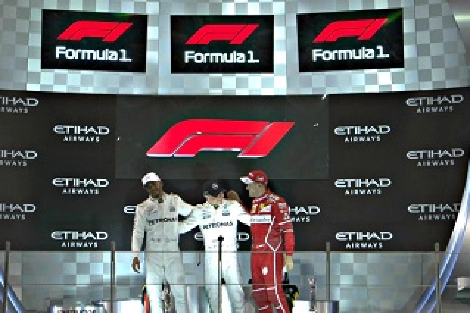
In its desire for change and to win back the public, the new owner of Formula 1, Liberty Media, took advantage of the last Grand Prix of the season to present the new Formula 1 logo, which replaces the previous one that had been in place for 23 seasons.
Completely red, this new logo aims to simplify its use for various commercial requests and becomes more practical to use for various digital platforms, as Sean Bratches, the commercial director of the discipline, explains: « Many brands, especially at this time, are trying to simplify their logo to enter the digital space. We felt it was necessary to go a little further and really re-equip ourselves to position ourselves and move forward. It is inspired by the low profile of the car, two single-seaters crossing the finish line. It’s incredibly bold and simple, so by applying this to the current market, mobile and digital, we have more flexibility and versatility with this logo. »
A new logo that paves the way for even greater global development for the F1 brand: « We are going to relaunch the brand, and we will introduce a new graphic package for our television production. We will highlight a new production concept, unveil an entirely new web platform, new social media channels, a live and non-live OTT platform », concludes Bratches.
After an amazing season – a new #F1 era awaits
Our greatest races are ahead of us
#Unleash2018 pic.twitter.com/1g0KSjeVhj— Formula 1 (@F1) 26 novembre 2017