New chart on TV this weekend to find out who the best brakemen are
As seen across our TV screens since Formula 1's 2018 collaboration with Amazon Web Services (AWS), more and more graphics are being made available to viewers to bring new data and additional details. This season, six new graphics are added to the list.
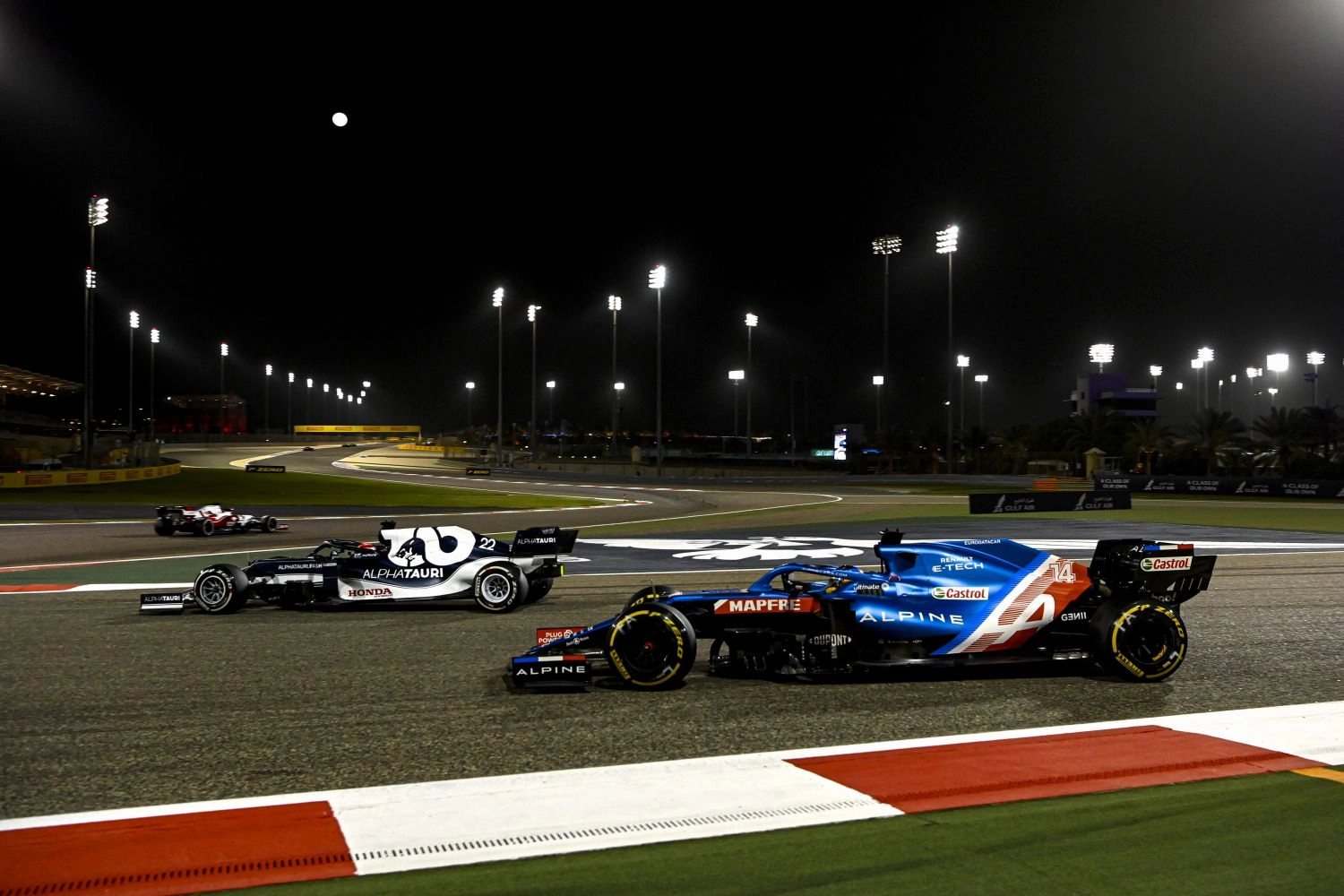
Indeed, since the introduction of these new graphics on television, they have often been controversial. Some see them as interesting additional content because of the data they provide, while others are not convinced at all, finding their predictions risky or removing the unpredictable aspect of the race. Jacques Villeneuve – former Formula 1 driver and commentator for Canal+ – calls the tire wear graphic: “Madame Irma”, a reference to the movie of the same name featuring a fake psychic, so skeptical he is about the accuracy of this data. However, this 2021 season, 6 new graphics will be available to viewers, bringing the total to 18.
The next addition will arrive this weekend at the Emilia-Romagna Grand Prix. It concerns the braking performance. While F1 fans already had access to brake graphics showing when drivers hit the brakes and the applied pressure, this new AWS Insight will show each driver’s braking point, the speed at which drivers move through corners, which drivers brake the hardest, the difference in speed reduction between different drivers, and the maximum g-forces generated.
Introducing Braking Performance, a new F1Insights addition powered by @awscloud ?
Keep your eyes peeled during the ImolaGP for its screen debut ?F1 pic.twitter.com/zsYrHuiux9 — Formula 1 (@F1) April 15, 2021
Therefore, there remain 5 graphics that will be implemented during the 2021 season. We already know the release dates of their publication as well as their purposes:
Car Exploitation: Starting from the Canadian Grand Prix (June 11-13), this graphic will show when drivers push their car to its limits of performance in terms of grip, braking, acceleration, and maneuvers, by comparing a car’s current performance in real-time to its theoretical performance limit, and calculating the relative time gained or lost per lap.
Energy usage: Starting from the British Grand Prix (16-18 July), this graph will show how the cars’ power units use energy throughout the race, also indicating when they use power from their battery and how much is left in reserve.
Departure analysis: From the Italian Grand Prix (September 10-12), this analysis compares each driver’s starts, both in terms of reaction and distance gained on rivals.
Pitlane Performance: From the Japanese Grand Prix (October 8-10), this analysis focuses on the time lost or gained during pit stops by the team and its driver, excluding the moments when the car is stationary.
Undercut threat: Starting from the Australian Grand Prix (November 19-21), this section will analyze the potential benefits that a driver could gain from an early pit stop in order to overtake a rival ahead of him.
The AWS graphics use machine learning and artificial intelligence tools to interpret and analyze data produced by the 300 sensors installed in each F1 car. However, it is logical and evident that these data are questioned by fans, as they do not always reflect the reality of events.
Rob Smedley, chief engineer of F1, said he believed the new graphics would help fans immerse themselves more in the details of the sport: “With this new set of race statistics for 2021, we are going further than ever.”
(New sentence) New graphics such as braking performance and the probability of undercutting help decipher race strategies and performances to make the sport even more understandable and exciting.
« We’re going further than ever » Rob Smedley
Do these new graphics represent a real interesting bonus for Formula 1 fans? Do all these data spoil some of the unpredictability of the sport? We will be able to form a first opinion as of this weekend at Imola, with this braking performance (b) graph.
